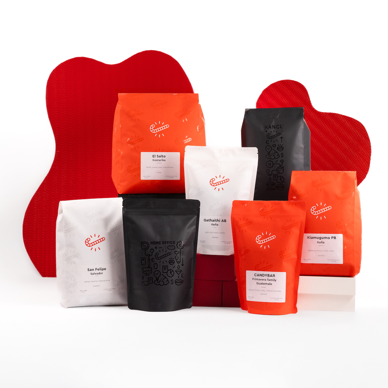
we have new packaging hurray
The appearance of our packaging has been elevated to heavenly heights once again by our esquirish designer Jakub Wdowka from the Artbureau studio.

After the introduction of the Kancl and Home office series, we fell in love with the glossy varnish on the packaging, which helps increase the attractiveness and sense of value, and "Precious" as Gollum would hiss.
When we started to solve a new type of packaging with a more efficient layout of information (you no longer have to look for the roasting date on the back and everything important has moved to one label), Jakub designed these beautiful variants of the white packaging for filtered coffee and a return to red packaging (those who remember will remember that we divided it like this 7 years ago and worked with this division for small bags).
So is it an innovation or a return to the old ways? One thing is clear when you now see Kancl, the classic coffee line, capsules and tripdrips next to each other, everything matches beautifully precisely because of the detail of the partial varnish. And that's what pets love the most. What do you think?